The Taste Space of Red Wine
An interactive two-axis map of red wine — fruit vs earth, fresh vs dense — and a small detour into why a UI/UX person finds wine so plottable.
Nothing to do with firmware this time. Just wine — and the small, satisfying problem of drawing a taste you can only describe in words.
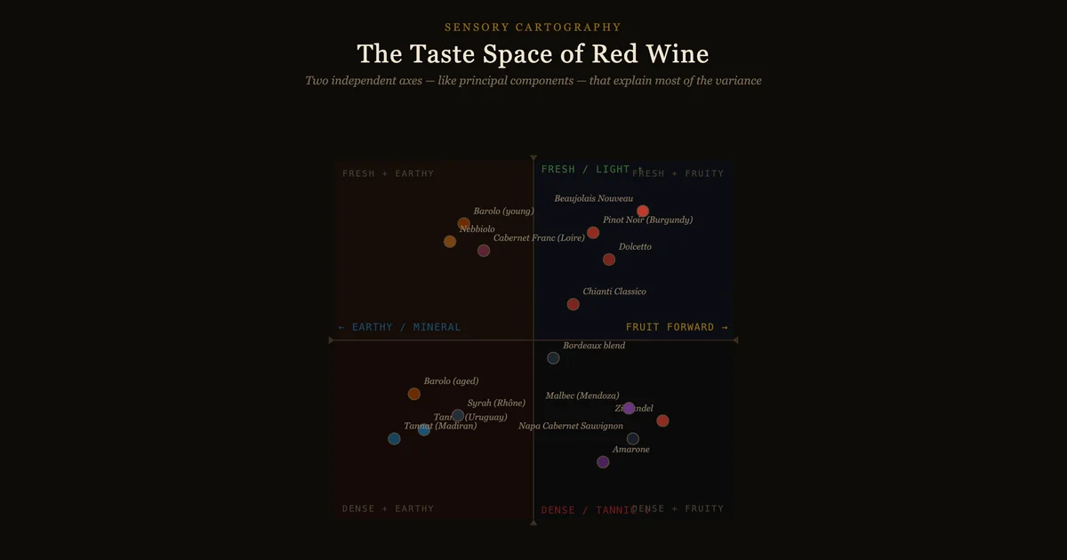
If you taste enough red wine you start to notice that most of the variation collapses onto two axes. It’s the same instinct as a principal-components plot: throw away the dimensions that barely move and keep the two that explain most of the variance. For red wine those two turn out to be:
- Fruit ↔ Earth — driven by ripeness, oak, and winemaking. Ripe vintages, new oak, and warm climates push right; cool climates, old vines, indigenous yeasts, and minimal intervention pull left toward mineral and tertiary character.
- Fresh ↔ Dense — driven by grape variety, extraction, and alcohol. High-acid varieties (Nebbiolo, Pinot) sit high; extended maceration, hot climates, and dried-grape methods (Amarone) push wines down into density.
Plot a few dozen wines on those axes and the regions sort themselves out: Beaujolais and Burgundy float up in the fresh-and-fruity corner, Barolo and Nebbiolo hold the fresh-and-earthy edge, Napa Cab and Zinfandel weigh down the dense-and-fruity quadrant, and Madiran Tannat anchors the dense-and-earthy extreme.
The map
Hover or tap any wine to read its tasting note. It’s a live widget, not a screenshot — the whole point was to make the taste space something you can poke at.
Why a UI/UX problem, not just a wine one
The hard part isn’t the wine — it’s the legend. A scatter plot of flavors is useless if the reader can’t recover the meaning of a position. So the design leans on a few small UI decisions:
- Quadrants are pre-labelled (
FRESH + FRUITY,DENSE + EARTHY, …) so a point’s neighbourhood is readable before you touch anything. - The axes are named twice — once as poles on the cross, once as a pair of cards underneath that explain what causes movement along each axis. Position without causation is just trivia.
- Hover state dims everything else, so a single wine and its note become the whole frame for a moment.
Positions are deliberately approximate — style varies enormously by producer, vintage, and terroir, and pretending otherwise would be the real inaccuracy. The map is a way of thinking, not a measurement.